The Hearth
Problem
Branding Audit
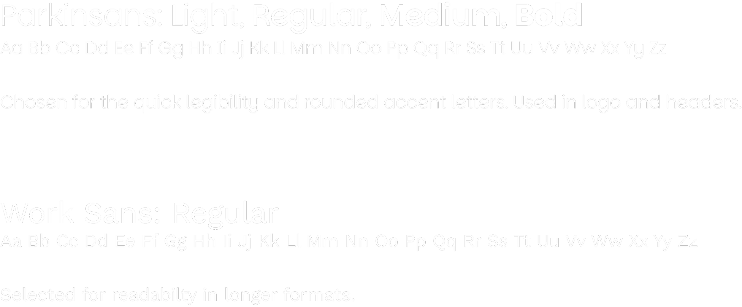
Design Languages
Fall 2025: Senior Capstone
The core problem was how to design a concert hall and brand system that felt authentically Vermont and rooted in local history, landscape, and community, while still functioning as a contemporary, competitive venue within the New England entertainment market. The challenge extended beyond architecture into identity: how could visual branding, wayfinding, and environmental graphics reinforce a sense of belonging without relying on familiar regional clichés?
Vermont lacks a purpose-built, mid-sized concert venue that serves both its music community and its residents. Existing venues in the region were not designed specifically for live music, nor were they created with Vermont’s cultural, architectural, or community values in mind. As a result, performances often feel disconnected from place, and audiences must adapt to spaces that prioritize function over experience.
After researching Vermont’s music industry and its physical spaces, I assigned design languages to the visual cues. These became the pillars of the brand.
Pillars
organic
shape and form
cabin
modular
woven
rhythm
crisp
color/type
Initial Sketches

Once I completed my research I jumped into creating a letter mark. Could achieve a crisp and warm letter H?

I always start my design with crisp corners, and refine as I achieve my vision.

These three designs are missing a key quality, welcoming energy. A stand alone H says, “You should know me already.”
Solution
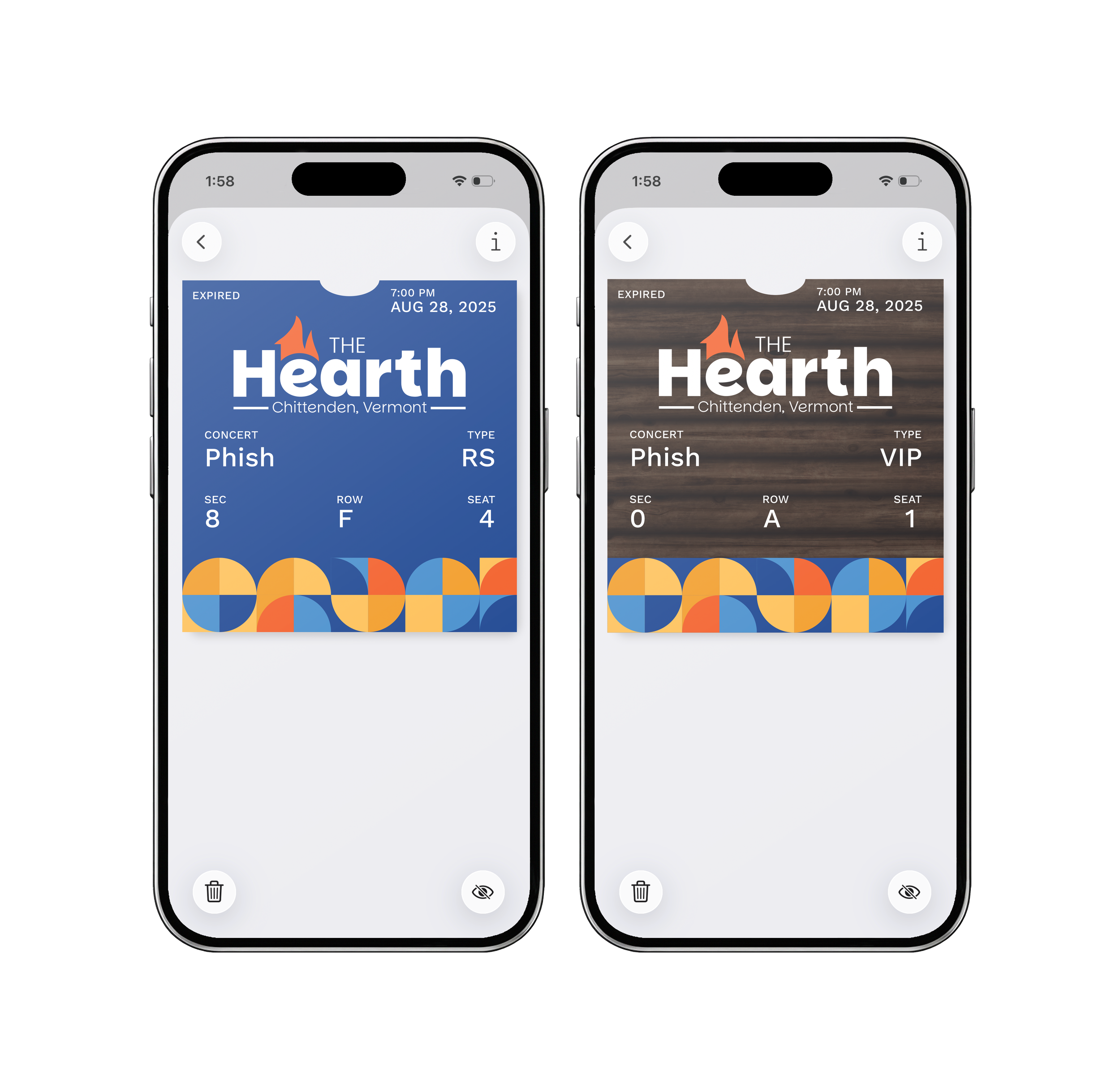
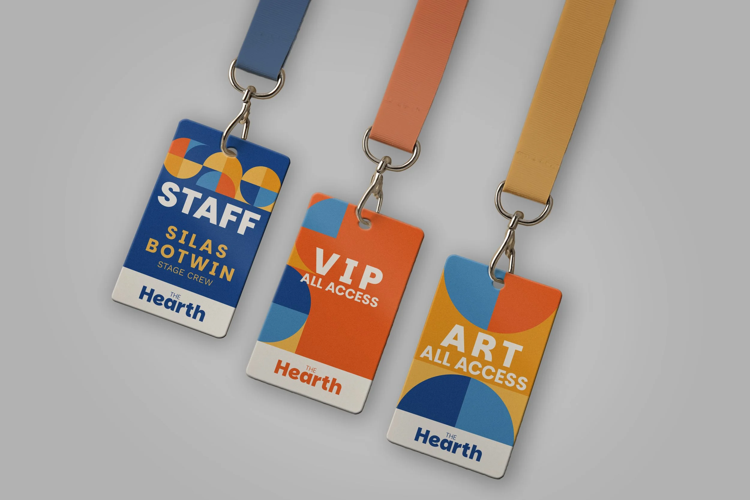
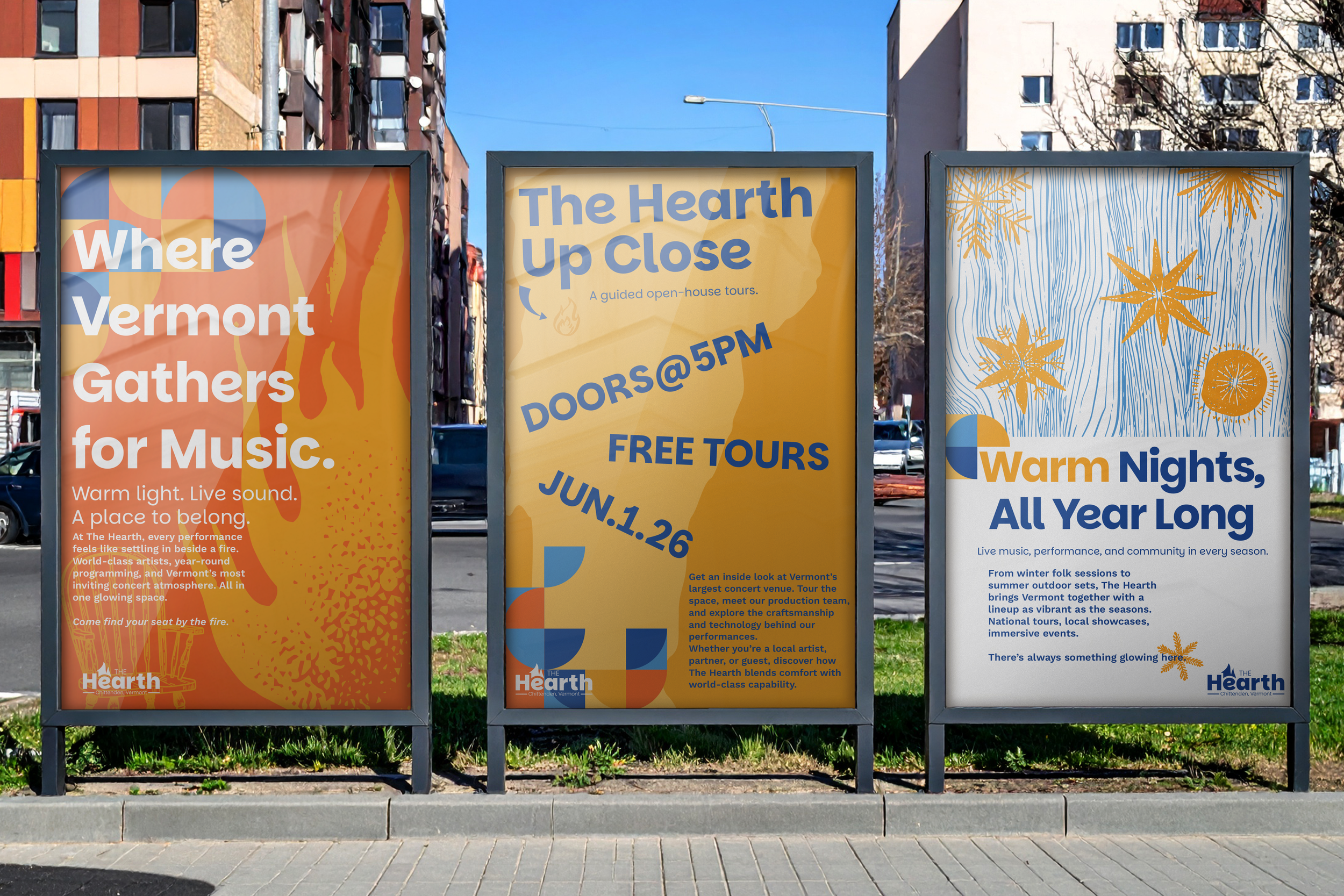
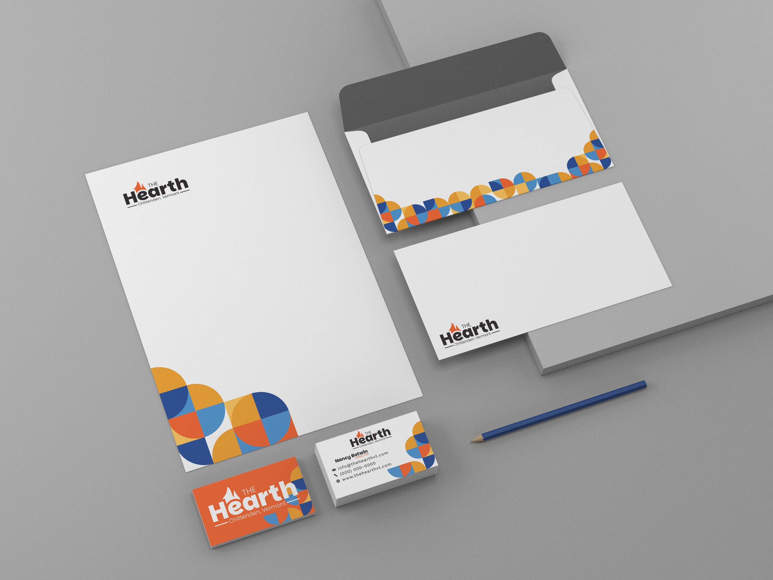
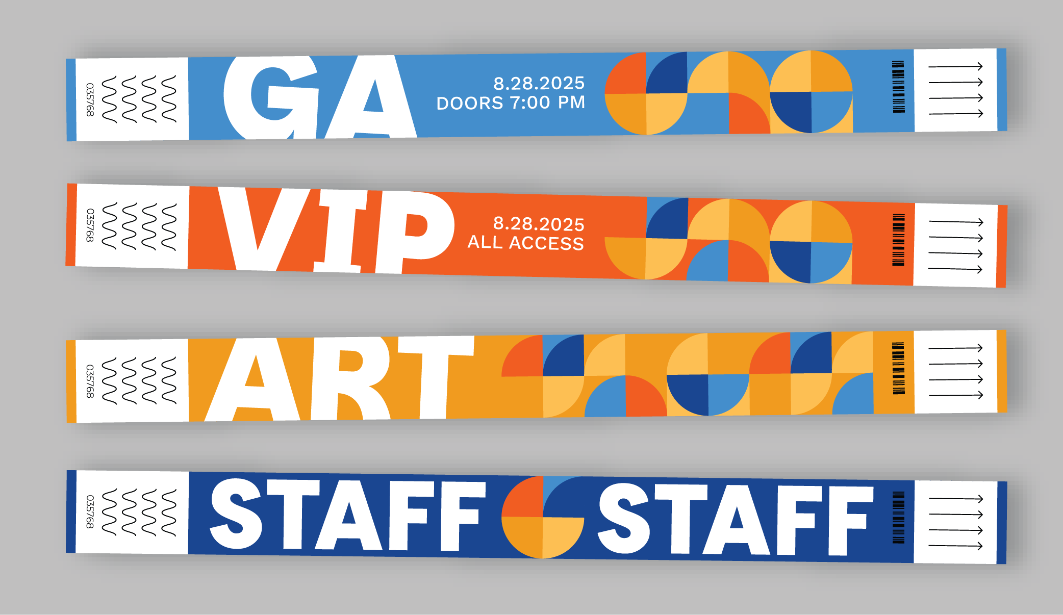
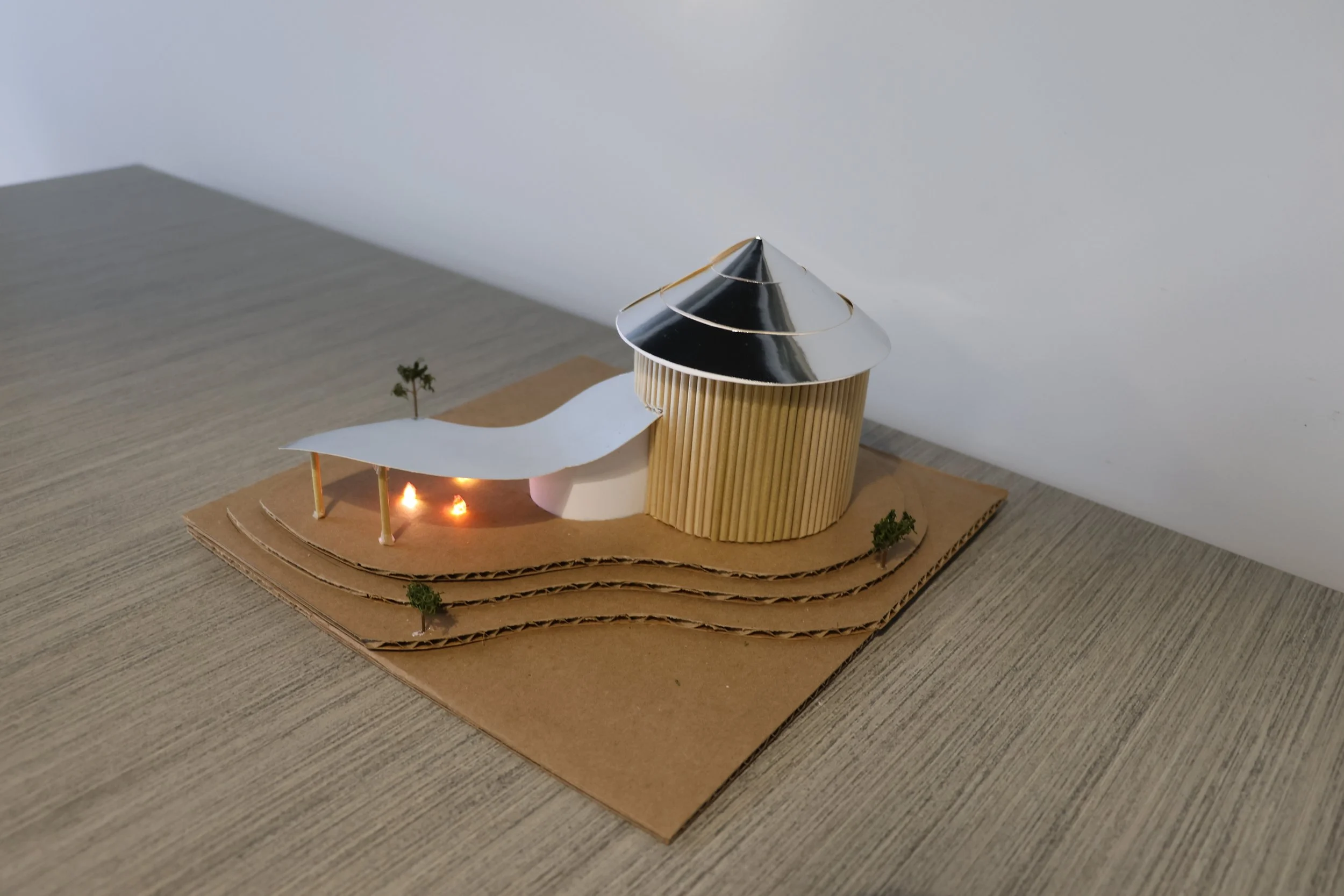
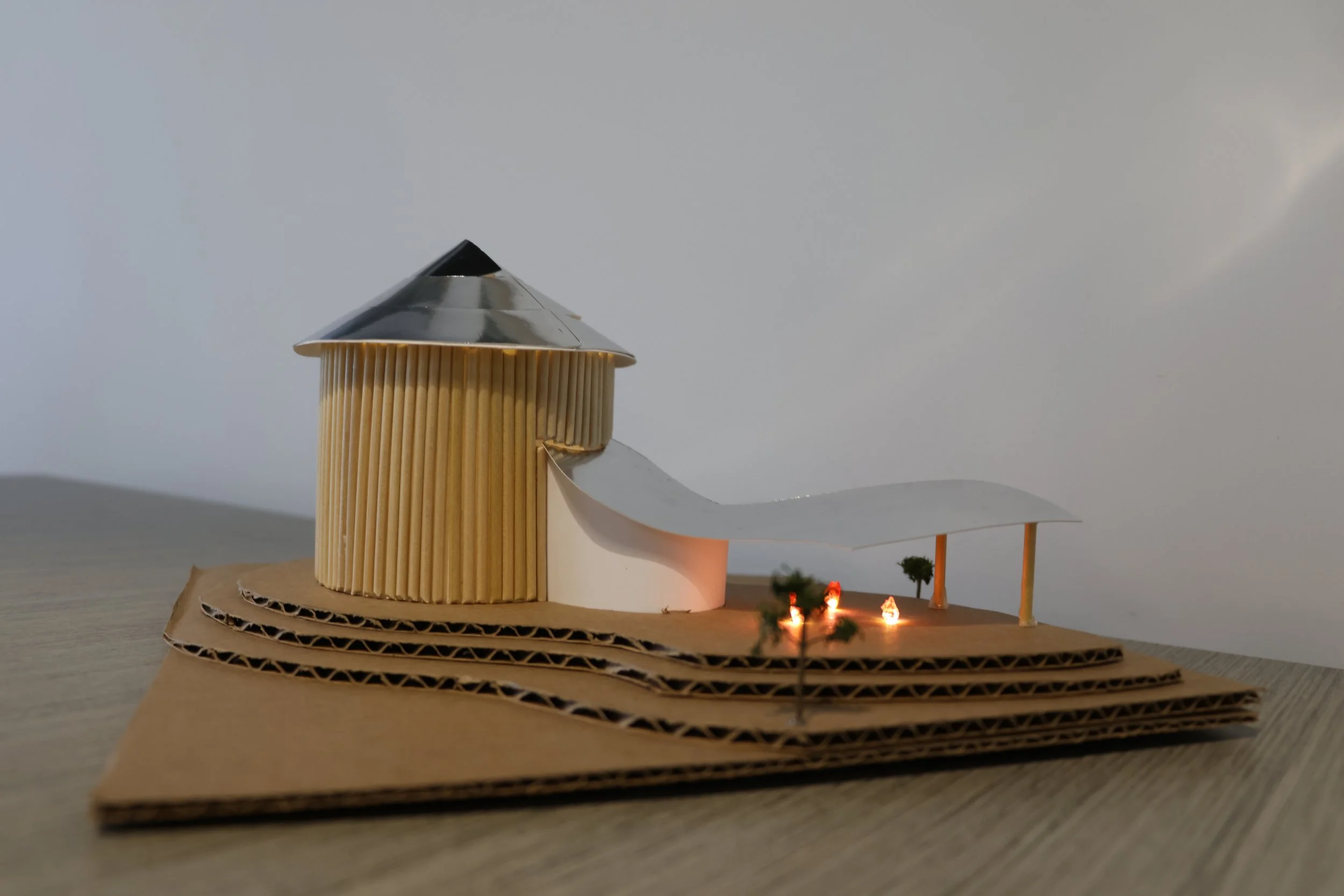
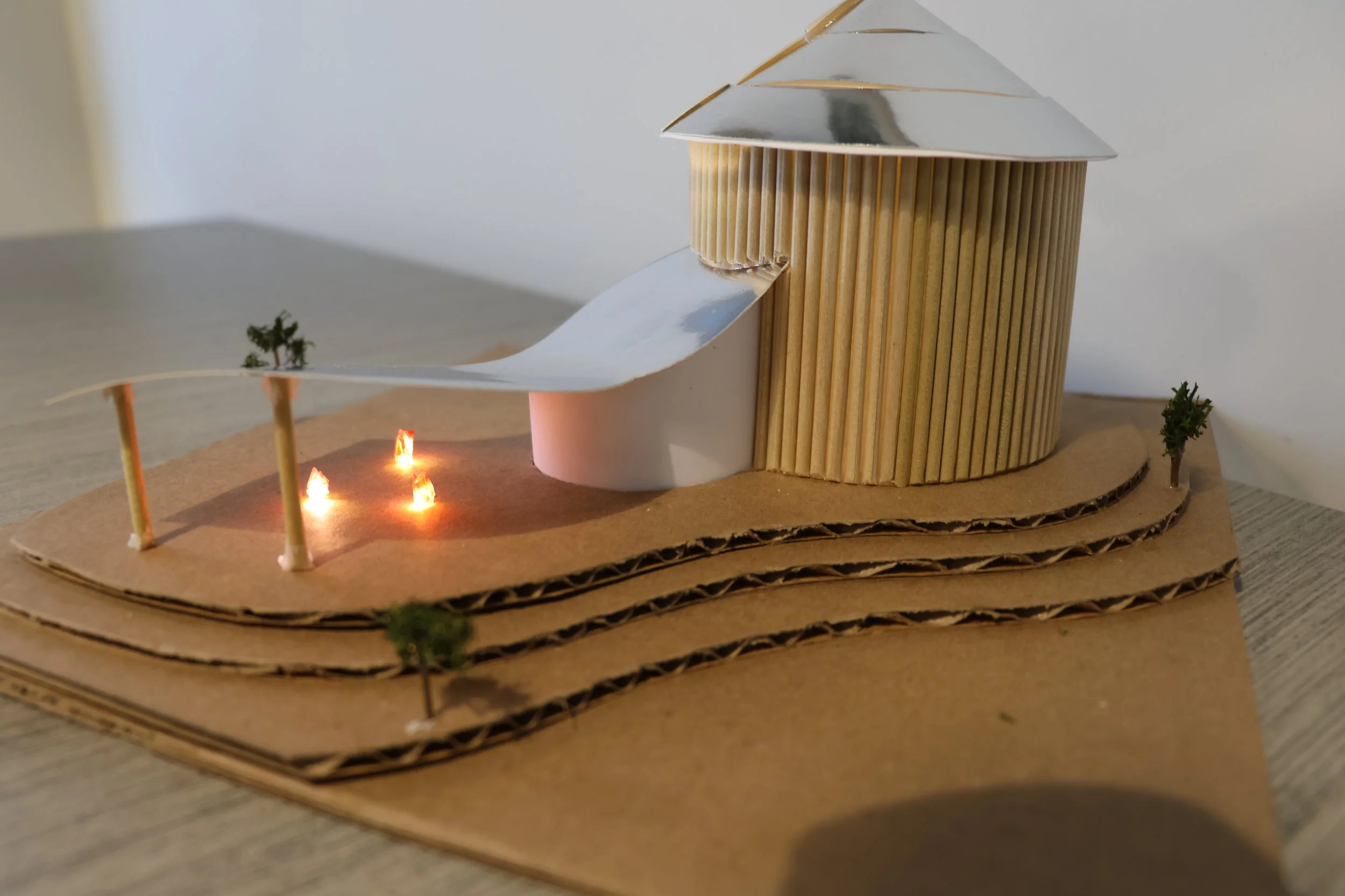
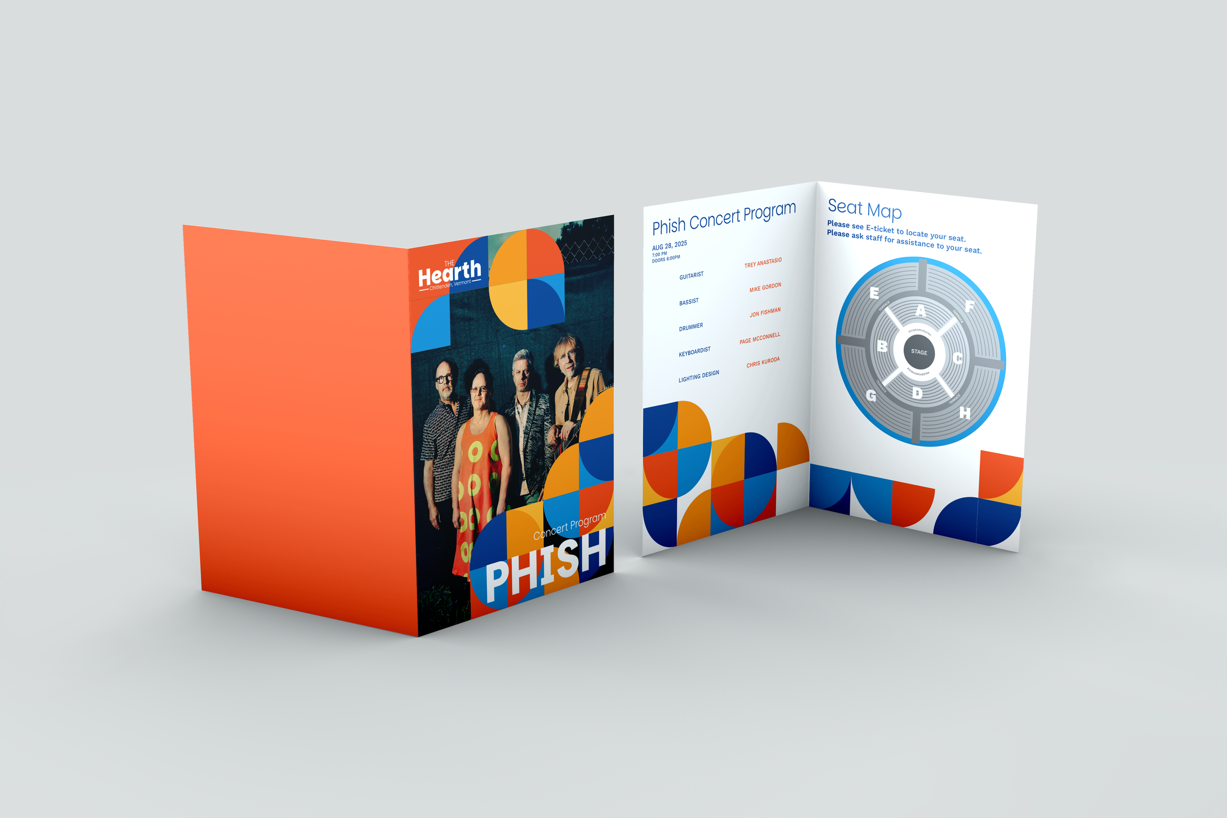
The Hearth is a concept for a 5,000-capacity concert hall serving Chittenden County, Vermont, within the live entertainment industry. Designed for local residents and visiting music audiences across New England, the project explores how a venue can differentiate itself in a competitive regional market while remaining rooted in place and community.
The initial challenge was to create a visual identity and spatial branding system that balanced Vermont’s natural character with a contemporary, professional tone, avoiding rustic clichés while still conveying warmth, connection, and authenticity. The goal of the project was to develop a cohesive brand system that could scale across environmental graphics, way finding, print, and digital touchpoint, reinforcing the venue as a year-round destination for gathering, music, and shared experience.

EMBER

RAY

CRISP

LAKE